
Digital transformation for £500m infrastructure services provider.
The Client
FM Conway is a family-owned business that has been established for over 60 years. Employing over 1,000 people, they manage and maintain essential infrastructure across the built environment, transportation, and the public sector.
Committed to using sustainable materials and pioneering circular supply chain management, FM Conway operates within 10 diverse divisions, including Electrical Vehicle Charging, which installs and manages charge points for London borough councils.
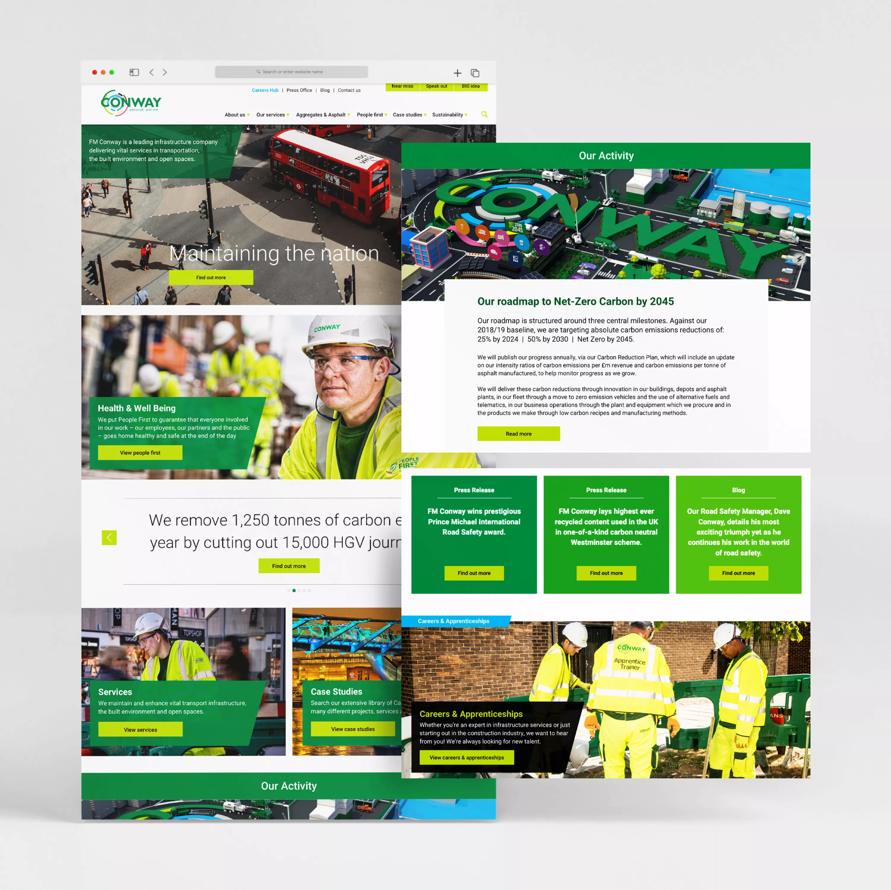
Working with Tiga is always such a joy. We have always had a positive working relationship with them, and they have produced some amazing work for us. We re-launched our whole website with Tiga and it could not have gone any better. Such a smooth process!
Marketing Director, FM Conway Ltd
The Requirement
As part of their continued improvement initiative, FM Conway’s Business Analysts carry out ongoing evaluations of all areas of the business, with the long-term objective of achieving full digital transformation.
The FM Conway corporate website – often a customer’s introduction to the brand – was identified as requiring redevelopment to improve the experience, effectively present the businesses’ products and services and enable customers to securely access their account data.
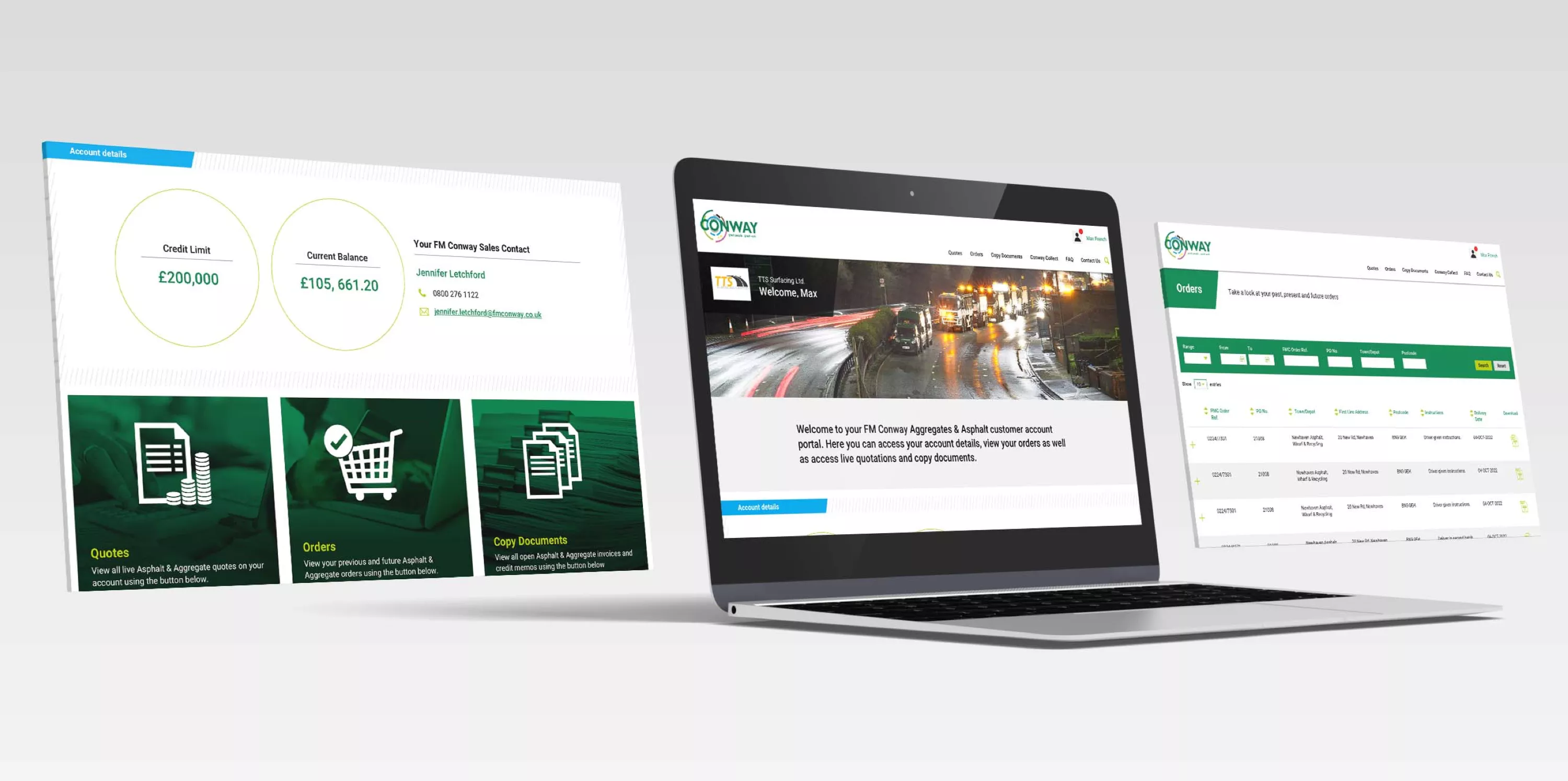
The website had to showcase FM Conway’s wide range of products and services and engage with a diverse audience of construction professionals at different stages of the project – from planning to development to maintenance. To provide the highest levels of customer service, a secure and easy-to-use account management application was required to enable customers to manage quotes and orders and access dispatch information.
The Solution
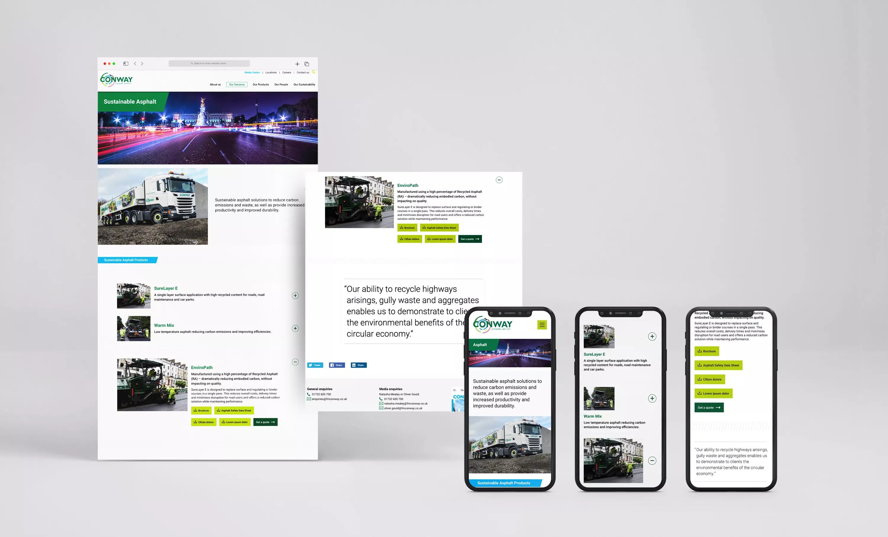
A key challenge in the development of this project was managing the diversity and volume of content available to visitors – both public and account holders – and the necessity to quickly engage and enable easy navigation.
Following analysis of FM Conway’s website performance metrics and discussions with key stakeholders across different divisions, initial site architecture and content maps were proposed. These passed through several rounds of iterations before an intuitive user interface was designed to meet the usage demands of the target audiences…
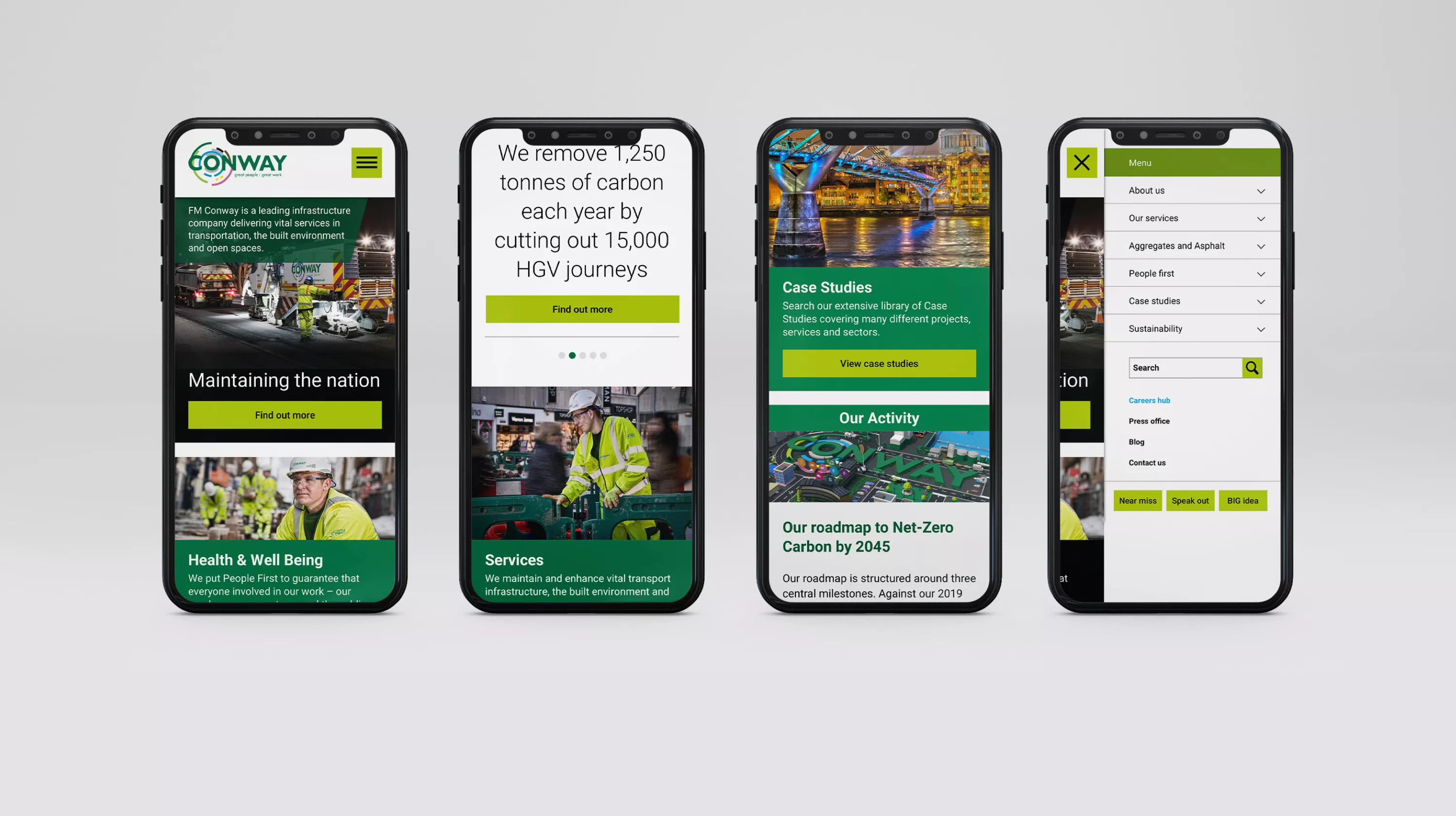
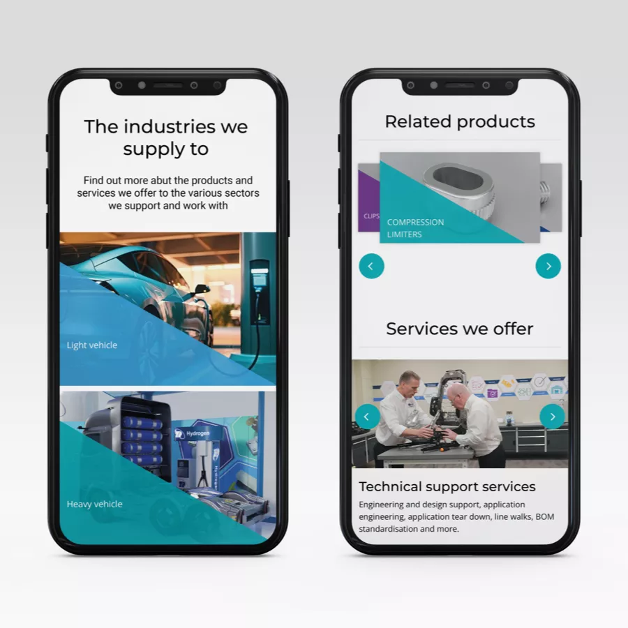
Device optimisation was used to provide the same experience on desktop, laptop, tablet and mobile.
Clear, image and icon-led visual signposting.
Jargon-free, plain English menu titles, headlines and copy that speak to the challenges faced by the visitor.
Depth, not breadth, navigation is used to give visitors the fewest number of choices at each step in their journey through the site.
A clear hierarchy was needed to direct visitors along the path most appropriate to them, with content structured to ensure they are nurtured through their journey.
Cross-site links to related and relevant content that will help extend dwell time.
Live customer order data was available through an API service. To make this available to customers, a secure authentication and onboarding process was developed alongside an integration with the API service. An initial proof of concept identified performance lag on certain data retrieval requests, which required us to carry out several reengineering iterations before response times were optimised.
A period of User Acceptance Testing was carried out, which included key customers, and following our process of pre-launch testing, the project was released to FM Conway’s IT team for production.
The Outcome
The cutover from the old to the new website was seamless and customers’ access to account data is operating smoothly. Feedback from both customers and the business has been positive, with the site now effectively presenting FM Conway’s services and values and providing an improved visitor experience.
Daily updates are being managed by the client’s internal Marketing Team with no intervention from us.
Who are Tiga?
Tiga is a B2B branding agency in Kent with over three decades of experience helping infrastructure and engineering brands clarify their message and strengthen their identity. From content and campaigns to design and brand positioning, we help B2B companies lead with purpose.
Looking to transform your brand presence? Contact Tiga today.

.webp)